Progress Bars
A progress bar is an inline node with a value and an optional label. The
spelling is PyMdownX's and is the canonical one, so the HTML preview and the
PDF build stay in sync out of the box; in print it becomes a \tsprogress
call from the ts-typesetting fragment, over the
progressbar package.
Syntax
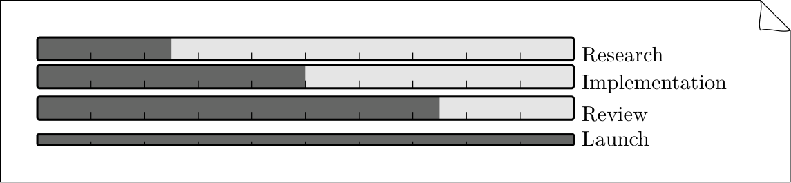
[=25% "Research"]
[=50% "Implementation"]
[=75% "Review"]
[=100% "Launch"]{.thin}
- Values must be percentages (
0 – 100). TeXSmith clamps the values if needed. - The quoted label is optional; when omitted the percentage is used.
- A trailing attribute list (
{.class #id}) attaches on any host. Use the.thinclass to halve the bar height (e.g. for tables or dense summaries); other classes reach the web stylesheet and are ignored in print. - The bar is inline, so it fits in a table cell. Consecutive bars on separate lines are separate paragraphs or hard-broken lines, and the template chooses the width.
- The fraction form
[=9/20 "Review"]and the{: .thin}attribute spelling are deprecated sugar, normalised bytmark lint --fix; see Migrating to TMark.
LaTeX output
The writer emits \tsprogress[thin]{0.45}{label}; the fragment expands it to a
\progressbar call with the following defaults:
{\progressbar[
  width=9cm,
  heighta=12pt,
  roundnessr=0.1,
  borderwidth=1pt,
  linecolor=black,
  filledcolor=black!60,
  emptycolor=black!10
]{0.73} Launch}
The .thin class switches heighta to 6pt. For more control, redefine
\tsprogress in your template or append to its pgfkeys family.
Example project
Use the bundled examples/progressbar project for smoke tests or screenshots:
cd examples/progressbar
texsmith progressbar.md --template article --output-dir build --build